Editor
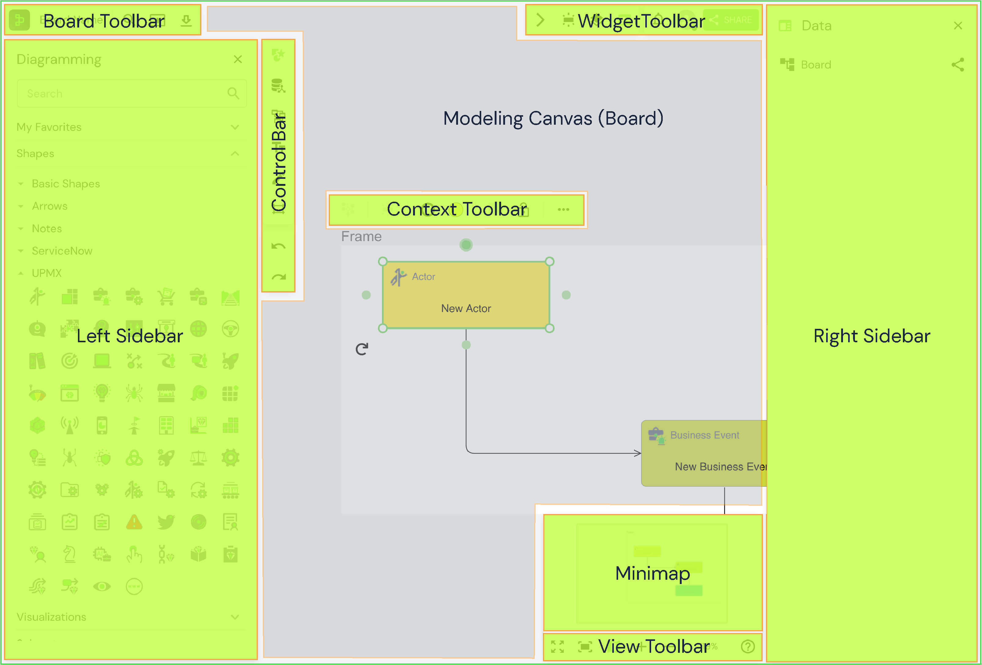
The YouDesign Editor is the core workspace for editors, equipped with a robust set of tools that allow you to craft dynamic content, integrating real-time ServiceNow data with various visual elements. From diagrams to models, the editor empowers users to create comprehensive, data-driven designs tailored to specific teamspace settings.
Tip: Hover over any icon to see a tooltip displaying its name.
Board Toolbar: Your Essential Controls
The Board Toolbar gives you access to fundamental tools and options for managing boards, from navigating to the homepage to exporting your work.
| Icon | Purpose | Action | Tip |
|---|---|---|---|
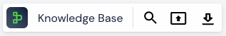
| YouDesign Icon | Acts as the "Home" button. | Click to navigate back to the homepage. | Use this to quickly return to your teamspaces or switch boards. |
| Board Name | Board identification and settings. | Click to rename or adjust board settings. | Keep names clear for easy identification when working with multiple boards. |
| Search | Quickly locate elements on the board. | Activate an in-board search to find text, images, or elements. | Efficient for navigating large boards with many components. |
| Present | Transform your board into a presentation. | Click to switch to Present Mode. | Organize frames beforehand for smooth presentations. Use full-screen mode for better impact. |
| Export | Export boards or frames in different formats. | Click to access export options for sharing or printing. | Ideal for sharing diagrams with non-users or preparing for external presentations. |
Widget Toolbar: Advanced Features at Your Fingertips
The Widget Toolbar offers access to advanced controls and insights, from real-time data integration to collaboration tools.
| Icon | Purpose | Action | Description |
|---|---|---|---|
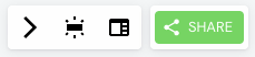
| Realtime Indicators | Manage real-time data indicators. | Opens the Realtime Indicators sidebar. | View and toggle real-time data options applied to your board. |
| Data Panel | Edit shape and relationship data. | Opens the Data Panel sidebar. | Modify data fields for shapes and their relationships. |
| Explorer | View board content overview. | Opens the Explorer for quick navigation. | Summarizes all board elements for easy access. |
| Notifications | Track updates and comments. | Opens the Notifications panel. | Stay informed about comments and updates in real-time. |
| Collaborators | View collaborators on the board. | Displays collaborator details. | Shows who is working on the board with you. |
| Share | Invite others to collaborate on the board. | Opens sharing options. | Add new collaborators, editors, or viewers to your board. |
Control Bar: Shape Your Canvas
The Control Bar allows you to access core design tools, such as adding text fields, creating frames, and navigating between panels.
| Icon | Purpose | Action |
|---|---|---|
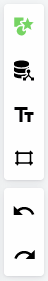
| Diagramming | Access the Diagramming Panel. | Click to open the Left Sidebar and view the Diagramming Panel. |
| Data Hub | Access the Data Hub. | Click to extend the Left Sidebar and view the Data Hub. |
| Text Field | Add text to your canvas. | Click to place a Text Field on the canvas. |
| Frame | Create a new frame. | Click to select a format and add a new frame to the canvas. |
| Undo | Undo your last action. | Use CTRL/CMD + Z or click the icon to reverse actions. |
| Redo | Redo your last undone action. | Use CTRL/CMD + Y or click to reapply the changes that were undone. |
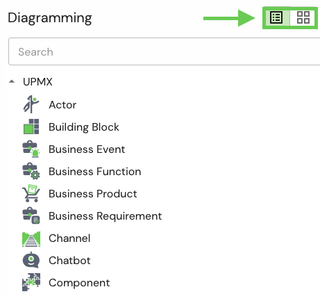
Left Sidebar: Explore and Manage Your Work
The Left Sidebar dynamically extends based on your selection in the Control Bar, offering a comprehensive view of diagramming elements, data, and more. You can also switch between List View and Tile View for better organization of your resources.
| Feature | Description |
|---|---|
| Search Bar | Quickly locate teamspaces, folders, or elements on the board. |
| List View | Displays items in a vertical list for easy browsing. |
| Tile View | Displays items as larger, clickable tiles for visual reference. |
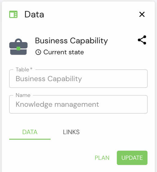
Right Sidebar: Data Panel for Quick Edits
The Data Panel allows you to edit elements directly within YouDesign, offering flexibility without needing to leave the board. You can modify:
- Visual elements (links, relationships)
- Frames (name, description, links)
- Board (copy board link)
- Attachments (view and edit)
Administrators can configure which fields are displayed for each element, ensuring that only relevant data is accessible for editing.
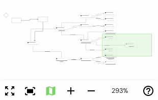
View Toolbar: Navigate and Control Your Canvas
The View Toolbar offers tools for zooming, fitting your canvas to the screen, and toggling full-screen mode.
| Icon | Purpose | Action |
|---|---|---|
| Fullscreen | Toggle Fullscreen mode. | Click to extend the YouDesign interface to fill the screen. |
| Fit to Screen | Adjust the canvas to fit within the screen. | Click to zoom and fit the current selection into view. |
| Minimap | Navigate the canvas easily with a bird's-eye view. | Click to open the minimap for broader canvas navigation. |
Modeling Canvas: Where Your Ideas Come to Life
The Modeling Canvas is the space where you create and bring your designs to life. Use all available tools to build your models, then share or present them with different view options.
Updated over 1 year ago